There's a reason you instantly feel calm in some spaces and strangely restless in others. A reason why one home feels like a deep exhale, while another, equally beautiful, feels loud, distracting, or exhausting.
More often than not, the answer lies in color.
Not in how expensive it is. Not in how trendy it looks on Pinterest. But in how honestly it reflects the person living inside the space.
At Vasterior, we believe color is not decoration. It's communication. It's memory. It's emotion translated into space.
And when chosen well, it doesn't just make a home look good, it makes it feel right.
Why Color Feels So Personal
Have you ever loved a color... but felt uncomfortable living with it?
Maybe a bold emerald green you admired online felt too heavy on your walls. Or a soft beige home that everyone called "timeless" left you feeling uninspired.
That disconnect happens when color is chosen visually, but not emotionally.
Every human being responds to color differently. Our nervous systems, personalities, routines, and emotional wiring all play a role in what feels grounding versus overwhelming. This is why copying a palette, even a beautiful one, rarely works unless it aligns with you.
A well-designed home doesn't impose a mood. It mirrors one.
Color as Identity, Not Aesthetic
In thoughtful interior design, color is never a random choice.
It answers questions like:
- Do you need calm or stimulation?
- Do you recharge in silence or expression?
- Are you structured, intuitive, nostalgic, ambitious?
- Do you crave warmth, clarity, grounding, or expansion?
Your color palette becomes a subtle extension of your personality, quietly supporting how you think, rest, work, and feel.
This is what we call color storytelling: The art of letting your space narrate who you are, without saying a word.
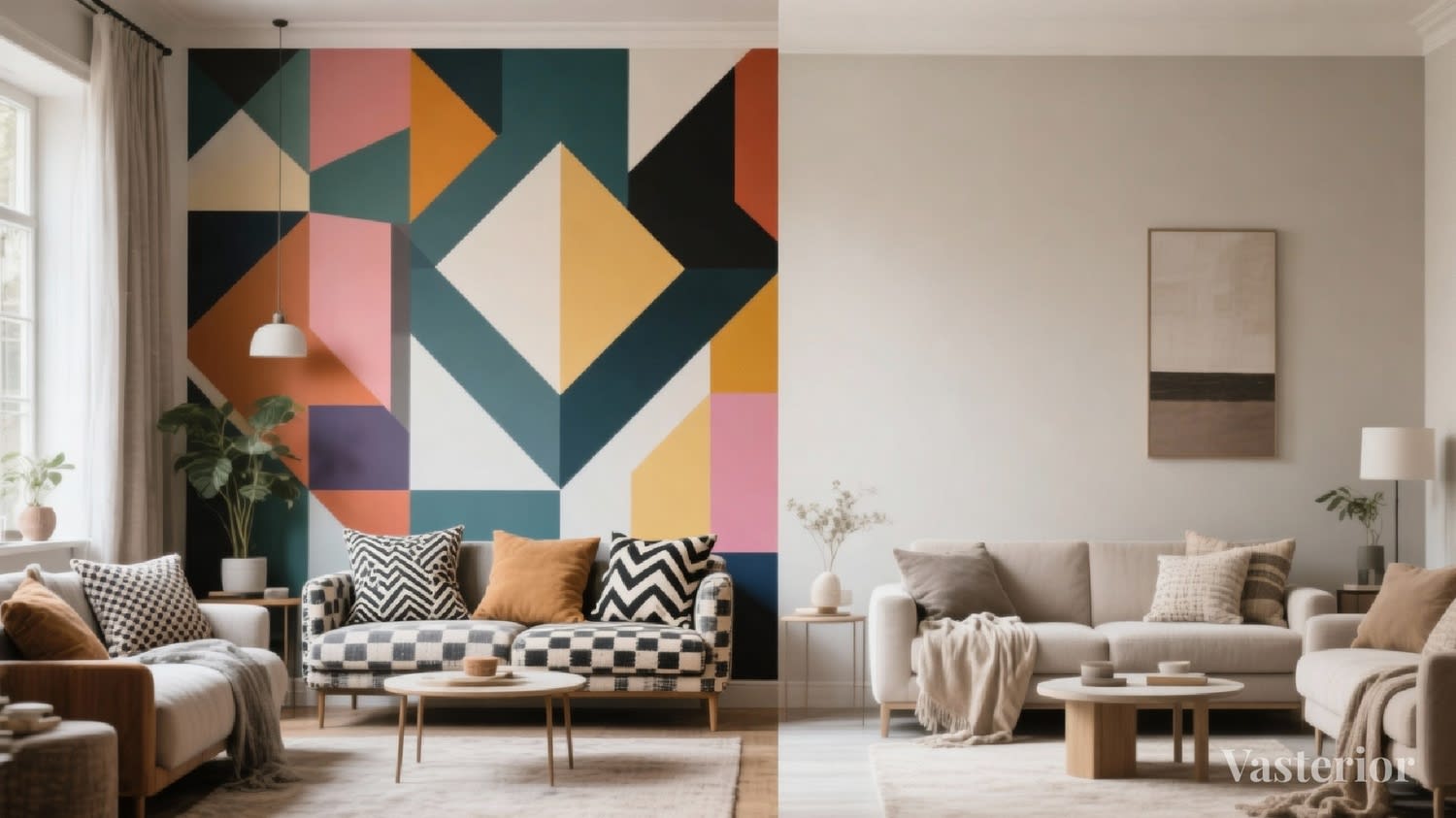
Personality-Driven Color Archetypes
While no one fits into a single box, most people lean towards certain emotional patterns. Understanding these can bring surprising clarity when choosing colors.
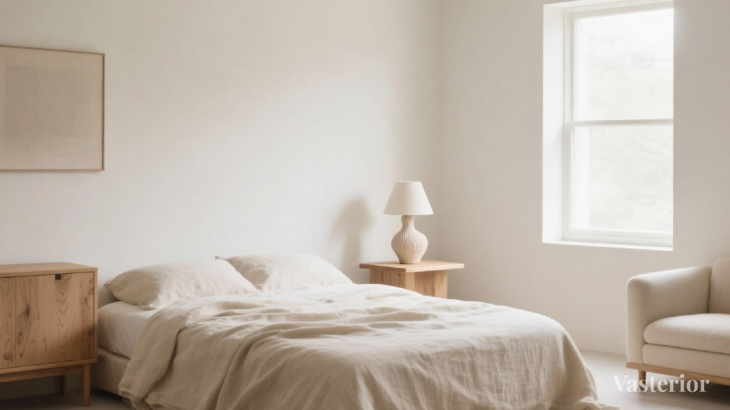
1. The Calm Minimalist
You value order, clarity, and mental peace. Visual noise drains you.
You gravitate towards:
- Soft whites
- Greige, sand, warm beige
- Muted taupes and pale greys
Avoid overusing:
• High-contrast blacks
• Loud patterns
• Too many accent colors
Ideal palette approach: Layer neutrals with subtle warmth, think texture over color. Linen, wood grains, soft stone finishes. The palette should feel like silence, not emptiness.
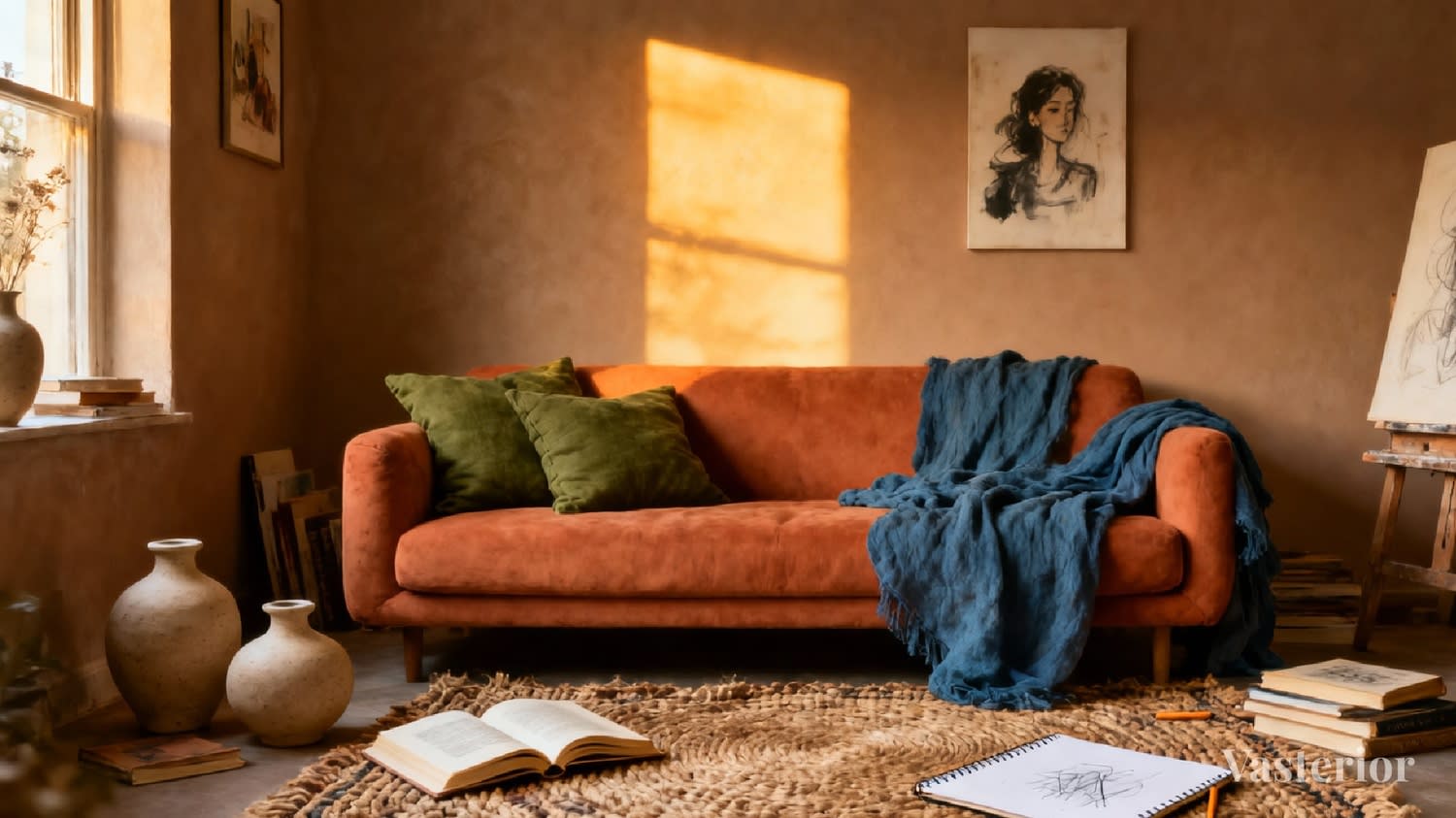
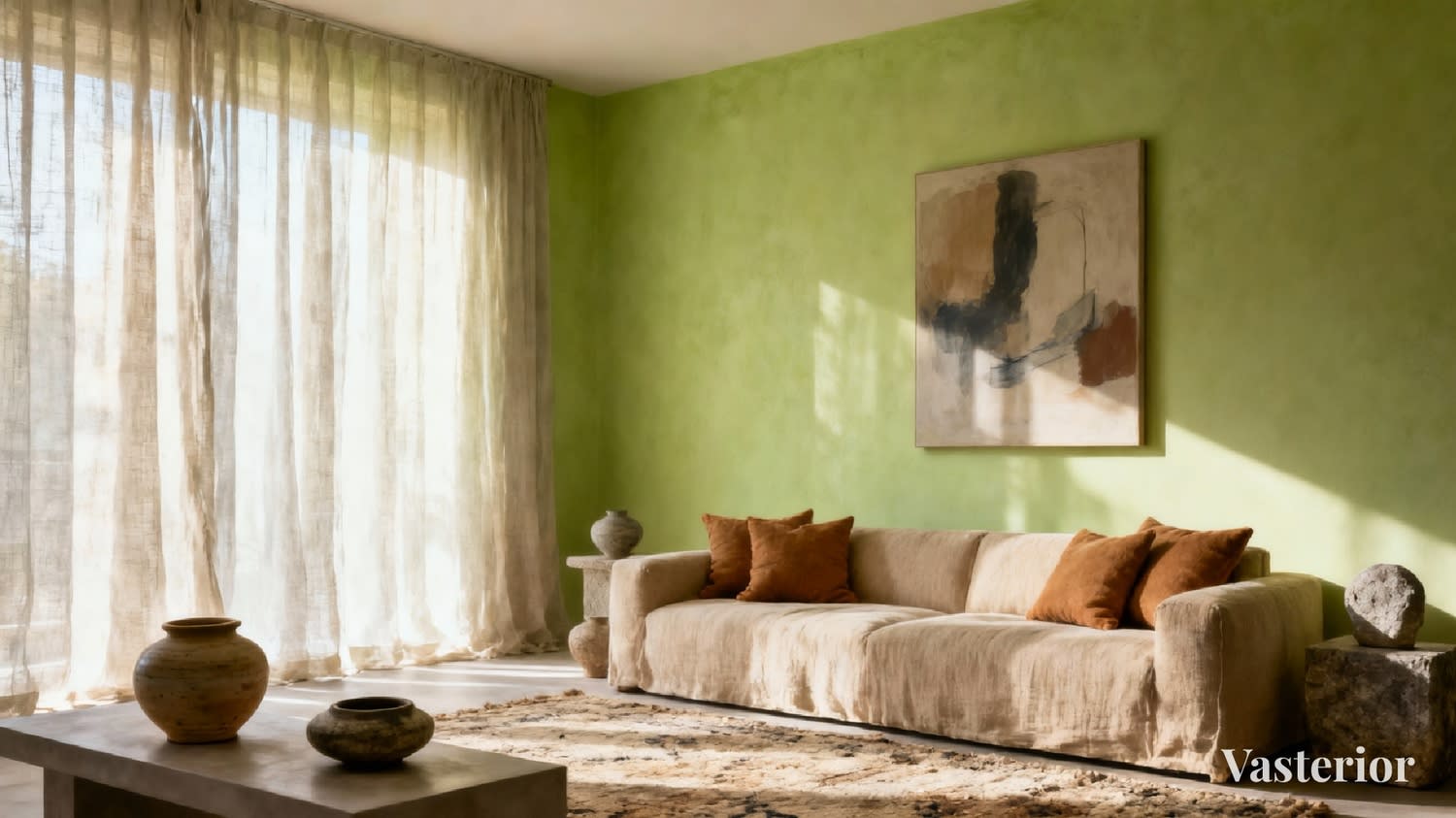
2. The Creative Explorer
You think visually, emotionally, and intuitively. Expression energizes you.
You gravitate towards:
- Terracotta
- Teal, indigo
- Olive green
- Muted pastels with character
Watch out for:
• Using too many bold colors in one space
• Creating visual chaos instead of rhythm
Ideal palette approach: Choose one expressive base color and let others support it quietly. Creativity thrives when there's a grounding neutral beneath it.
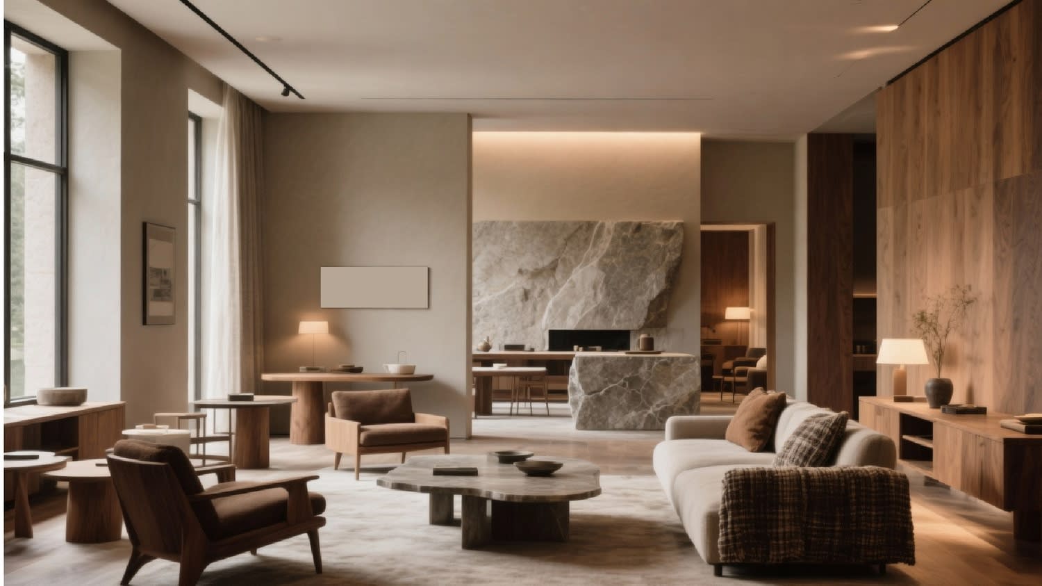
3. The Grounded Traditionalist
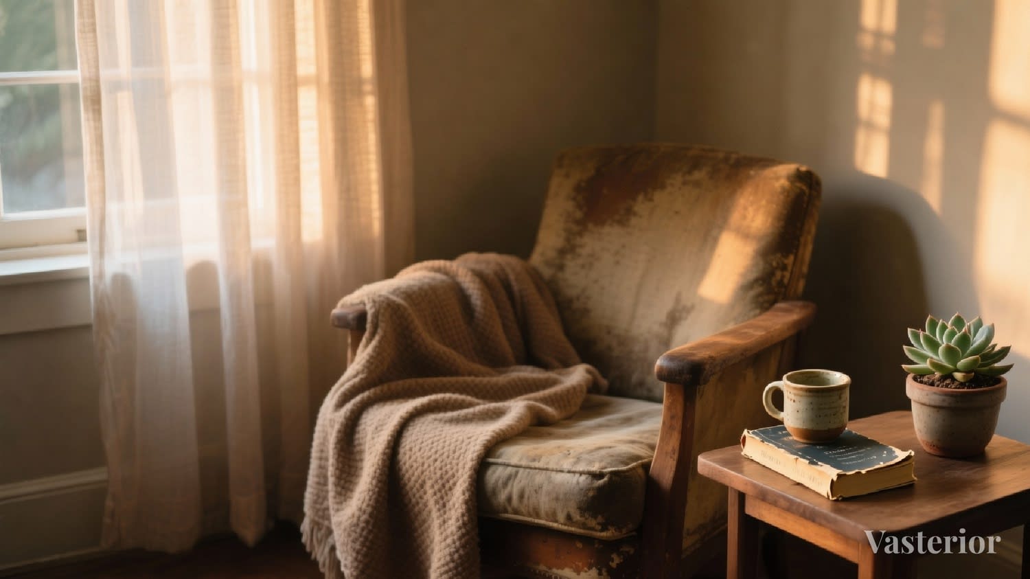
You value stability, heritage, and emotional security. You like things that feel familiar and timeless.
You gravitate towards:
- Warm browns
- Creams and ivories
- Soft golds
- Earthy greens
Avoid:
• Stark whites
• Cold greys
• Ultra-modern contrasts
Ideal palette approach: Build warmth gradually. Let colors feel lived-in, not styled. This palette ages beautifully and holds emotional weight.
4. The Bold Visionary
You're ambitious, driven, and forward-thinking. Your space fuels momentum.
You gravitate towards:
- Deep blues
- Charcoal
- Burgundy
- Strong accent tones
Balance is key: Too much intensity can overstimulate or create restlessness.
Ideal palette approach: Use bold colors strategically, feature walls, upholstery, artwork, balanced with calm neutrals that allow the mind to rest.
5. The Emotional Nurturer
You are sensitive to energy and atmosphere. Comfort matters deeply to you.
You gravitate towards:
- Soft blush
- Powder blues
- Lavender undertones
- Gentle greens
Avoid:
• Harsh lighting
• Very dark, heavy tones
Ideal palette approach: Think softness and flow. Colors should feel like a hug, never sharp, never aggressive.
Why Lifestyle Matters More Than Likes
Two people may love the same color, but need it used very differently.
A founder working from home needs focus and clarity. A homemaker may need warmth and emotional ease. A creative professional may crave stimulation in one room and calm in another.
Color must respond to how a space is lived in, not just how it looks.
For example:
• Bedrooms thrive on rest-oriented palettes.
• Home offices need mental clarity.
• Living rooms need emotional balance.
• Kitchens need energy, but not chaos.
This is why choosing colors room-by-room, instead of for the home as a whole, often leads to imbalance.
Good palettes consider the flow between spaces, not just individual rooms.
Common Color Mistakes (That Are Completely Understandable)
Most homeowners don't get color wrong, they just don't get enough guidance.
Some common missteps:
- Choosing colors without considering natural light
- Picking samples under showroom lighting
- Selecting each room independently
- Following trends that don't align emotionally
- Using accent colors without a base narrative
None of these are "mistakes" in isolation, but together, they create homes that feel disconnected.
Designing Color with Intent: The Vasterior Way
At Vasterior, color selection is never an afterthought.
We don't start with swatches. We start with people.
Our approach blends:
• Personality understanding
• Lifestyle analysis
• Natural light behavior
• Spatial flow
• Subtle Vastu logic (without superstition)
We see color as a tool to:
• Reduce mental clutter
• Enhance focus
• Improve emotional comfort
• Create continuity across spaces
This is why our palettes rarely feel loud or forced. They feel inevitable---as if the home always knew what it wanted to be.
Your Color Story Already Exists
The truth is, the right palette is rarely something you need to search for.
It already lives in:
• The clothes you wear repeatedly
• The places you feel calm
• The colors you associate with comfort
• The moods you want your home to hold
Design is simply the act of listening carefully enough to translate those signals into space.
When color aligns with personality, a home stops performing, and starts supporting.
And that's when it truly becomes yours. Call us today at +91 9100883355 or info@vasterior.com.