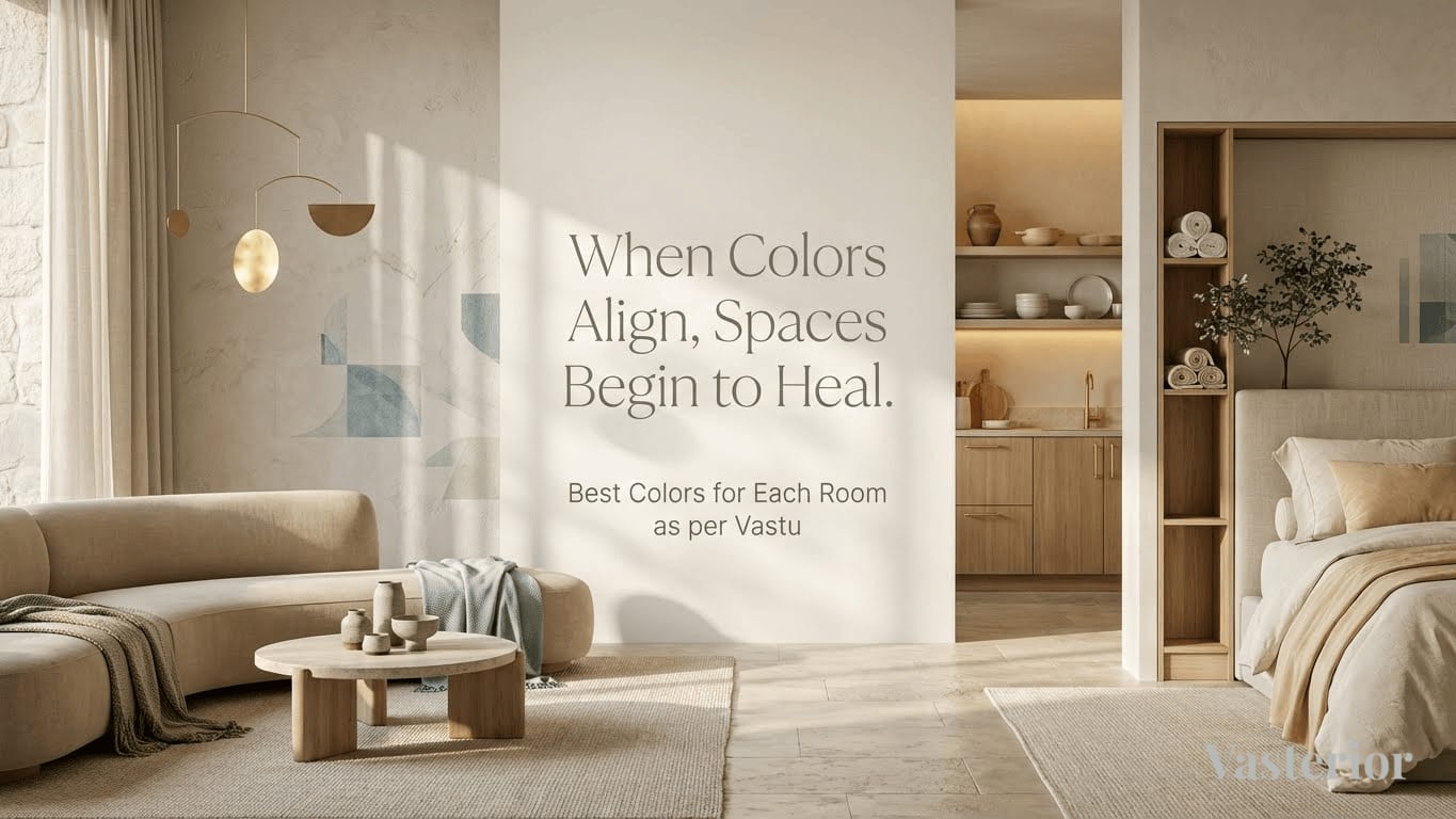
Color is never just color.
In a home, it becomes mood, memory, movement, and most importantly, energy. We instinctively know this. A room painted in the wrong shade can feel restless. Another, bathed in the right tone, feels grounding even on the longest days.
At Vasterior, we look at color not merely as an aesthetic choice, but as a spatial decision, one that subtly shapes health, relationships, productivity, and prosperity. When guided by Vastu, color becomes one of the most powerful yet non-invasive tools to align a home energetically without altering its structure.
This guide decodes the best colors for each room as per Vastu, interpreted through a modern, design-forward lens, so your home feels as beautiful as it feels balanced.
Why Colors Matter in Vastu
Vastu is often misunderstood as rigid rules or superstition. In reality, it is a spatial science that studies how humans interact with natural forces, light, heat, direction, and material energy.
Colors influence Vastu because they:
• Represent the five elements (Panchtatva): Earth, Water, Fire, Air, and Space
• Affect human psychology and emotional response
• Modify how energy flows within a space
For instance, fiery colors activate movement and appetite, while earthy tones ground and stabilize. Problems arise when colors are chosen purely for trend value---without considering direction, usage, and energy.
A Pinterest-perfect palette may look stunning, but if it clashes with the room's elemental nature, the space can feel perpetually "off."
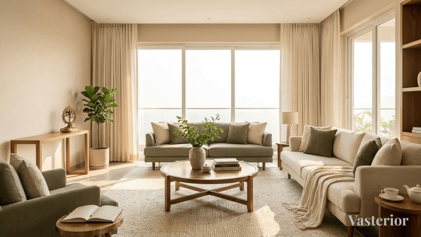
Living Room Colors as per Vastu
The Energy Gateway of the Home
Ideal Directions: North, East, North-East
The living room sets the energetic tone of the entire home. It welcomes guests, conversations, ideas, and opportunities.
Recommended Colors:
• Soft beige, cream, ivory
• Pastel greens and light yellows
• Warm off-whites
These shades enhance openness, warmth, and positive social energy.
Colors to Avoid:
• Heavy blacks or deep reds dominating the space
• Extremely dark greys without balance
Design Tip: Use darker tones only in furniture, artwork, or accents, never as dominant wall colors. Balance is key.
Bedroom Colors as per Vastu
Spaces of Rest, Intimacy, and Recovery
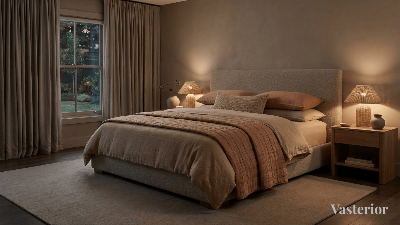
Master Bedroom
Ideal Direction: South-West
Best Colors:
• Earthy browns
• Muted terracotta
• Soft peach, dusty rose
• Taupe and warm greys
These tones promote stability, emotional security, and deep rest.
Avoid:
• Bright reds
• Stark whites without warmth
• Jet black
Children's Bedroom
Best Colors:
- Light green
- Sky blue
- Pastel yellow
These encourage growth, curiosity, and calm focus.
Kitchen Colors as per Vastu
The Fire Zone of the Home
Ideal Direction: South-East (Agni Kon)
The kitchen represents nourishment and vitality.
Recommended Colors:
• Soft red accents
• Coral, peach
• Warm orange
• Muted yellows
Avoid: Dark blue or black (water-dominant shades)
Design Tip: In modern kitchens, fire colors need not be loud. Use them subtly---in backsplashes, accessories, or lighting warmth.
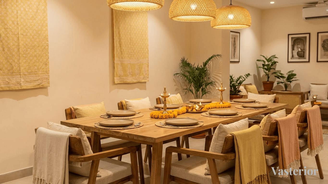
Dining Area Colors as per Vastu
Where Nourishment Meets Conversation
Best Colors:
• Cream
• Light peach
• Soft yellow
• Earthy neutrals
These colors enhance appetite and family bonding.
Avoid overly cold or dull tones that suppress energy and conversation.
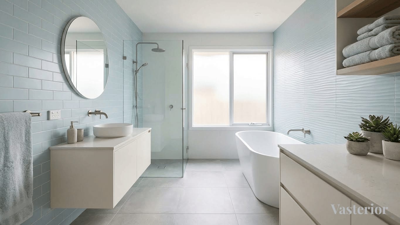
Bathroom & Toilet Colors as per Vastu
Spaces of Release and Detox
Recommended Colors:
• Light blue
• Sea green
• White with warmth
• Pale grey
These help maintain cleanliness, clarity, and emotional balance.
Avoid:
• Deep reds
• Very dark tones that trap stagnant energy
Study / Home Office Colors as per Vastu
Focus, Growth, and Clarity
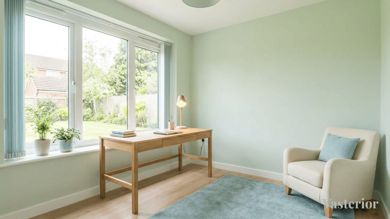
Ideal Directions: North, East
Best Colors:
• Light green (focus & growth)
• Soft blue (clarity)
• Cream or off-white
Avoid overly stimulating colors that cause restlessness.
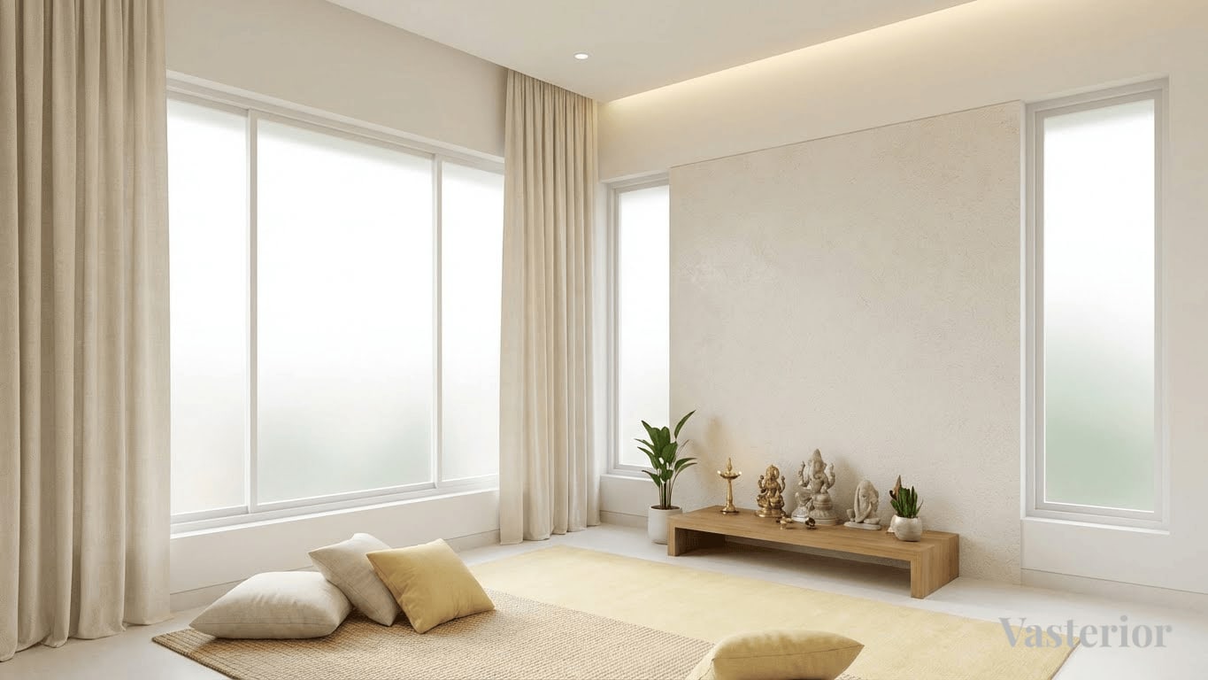
Pooja Room & Meditation Space Colors
Stillness, Clarity, and Connection
Best Colors:
• White
• Cream
• Light yellow
• Very soft pastel tones
These enhance purity, calmness, and spiritual focus.
Guest Bedroom Colors
Comfort Without Overstimulation
Recommended Colors:
• Soft neutrals
• Pastel blues
• Light greys with warmth
The goal is comfort and neutrality, never dominance.
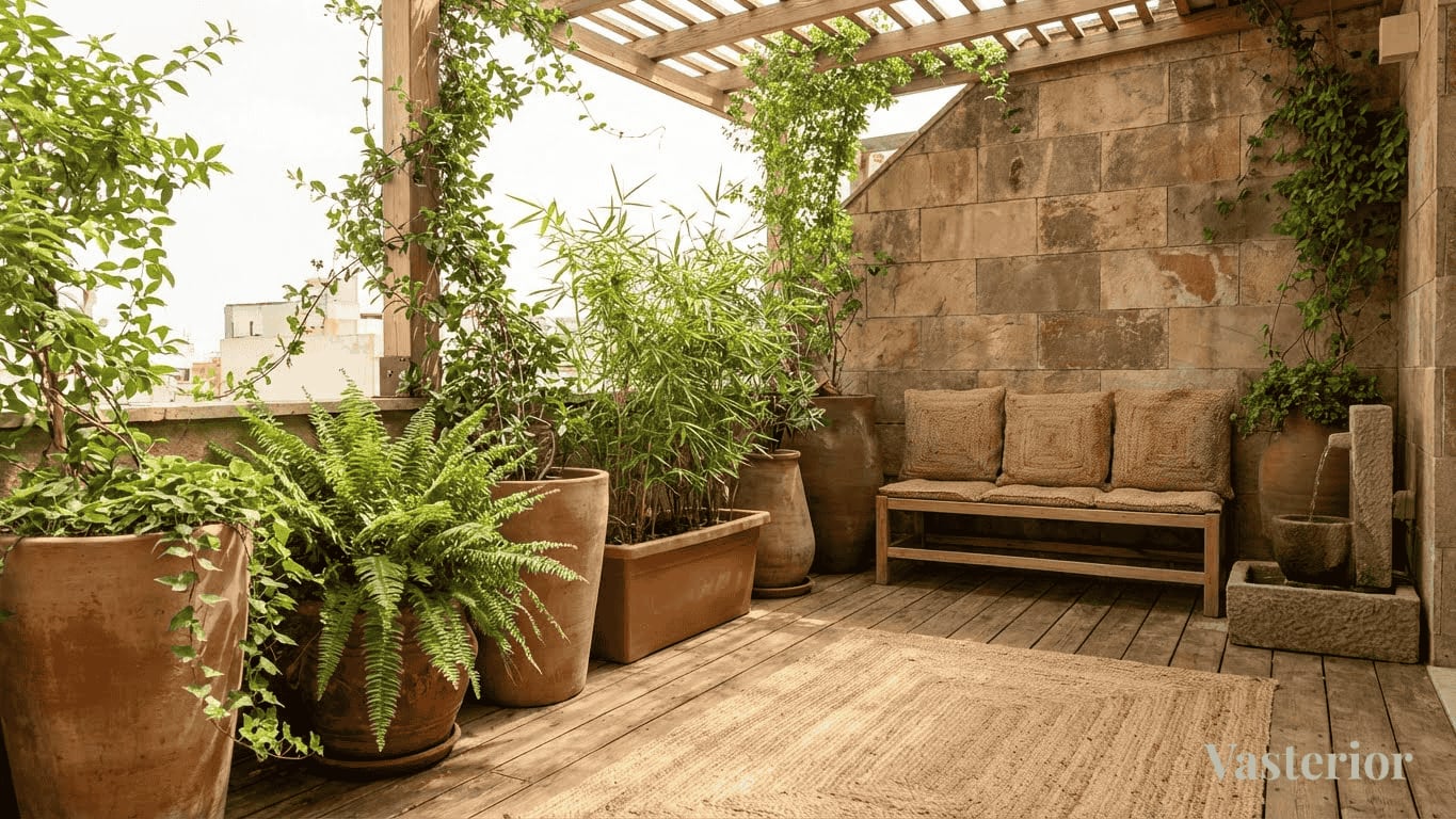
Balcony & Outdoor Areas
Breathing Spaces of the Home
Best Colors:
• Earthy browns
• Greens
• Natural stone shades
Pair with plants to enhance vitality and air circulation.
Common Vastu Color Mistakes to Avoid
- Following trends without directional logic
- Overusing dark shades in rest areas
- Copying hotel or café interiors blindly
- Treating Vastu colors as rigid rules
Vastu is about alignment, not restriction.
Vastu Colors in Modern Apartments
Most urban homes cannot change layouts, and they don't need to.
Color becomes the simplest corrective tool:
• Use paint, fabrics, rugs, art, and lighting
• Introduce balance instead of demolition
• Correct energy without disturbing design intent
This is where professional guidance makes all the difference.
The Vasterior Approach to Color & Vastu
At Vasterior, we don't "apply colors." We orchestrate them.
Every palette is derived from:
• Directional energy
• Functional use of the space
• Material compatibility
• Human psychology
Our goal is never to make a home look "Vastu compliant", but to make it feel effortlessly aligned.
Final Thoughts
When chosen consciously, color becomes a silent healer.
You don't need dramatic changes. Sometimes, a shift in shade is enough to shift how a space supports your life. Contact us today at +91 9100883355 or info@vasterior.com.
Approach Vastu with clarity, not fear, and let design do the rest.